
Serif font
Presti Display
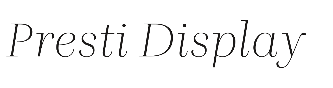
Presti is basically constructed as “expansion contrast," as written with a sharp-nib pencil. The classic appearance is emphasized by the many Open Type features (such as a choice of figures and small caps) and the extensive set of floating flourishes.
- Designer
- Petr van Blokland
- Foundry
- TYPETR
- Good for
- Headings
Picked by Font Brainy and Boon
Is Presti Display free for commercial use?
Yes, with an Adobe Creative Cloud plan: Presti Display is on Adobe Fonts, and the plan's licence covers commercial work while you are subscribed.
What Font Brainy paired it with
- Font Pairings for Landing Pages
The quiet edit. Free returns for 60 days on 3,000 pieces.
With Elza (body)

More serif fonts in Boon
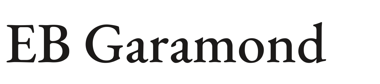 EB GaramondFREE
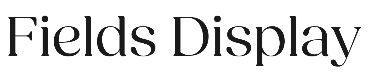 Fields DisplayADOBE
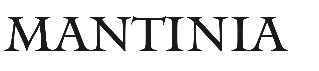 MantiniaADOBE
 BrawlerFREE
 Arbutus SlabFREE
 Sawarabi MinchoFREE
Find the next one with Boon
Tell Boon the job in plain words and get fonts that fit it, paired, with every licence spelled out.